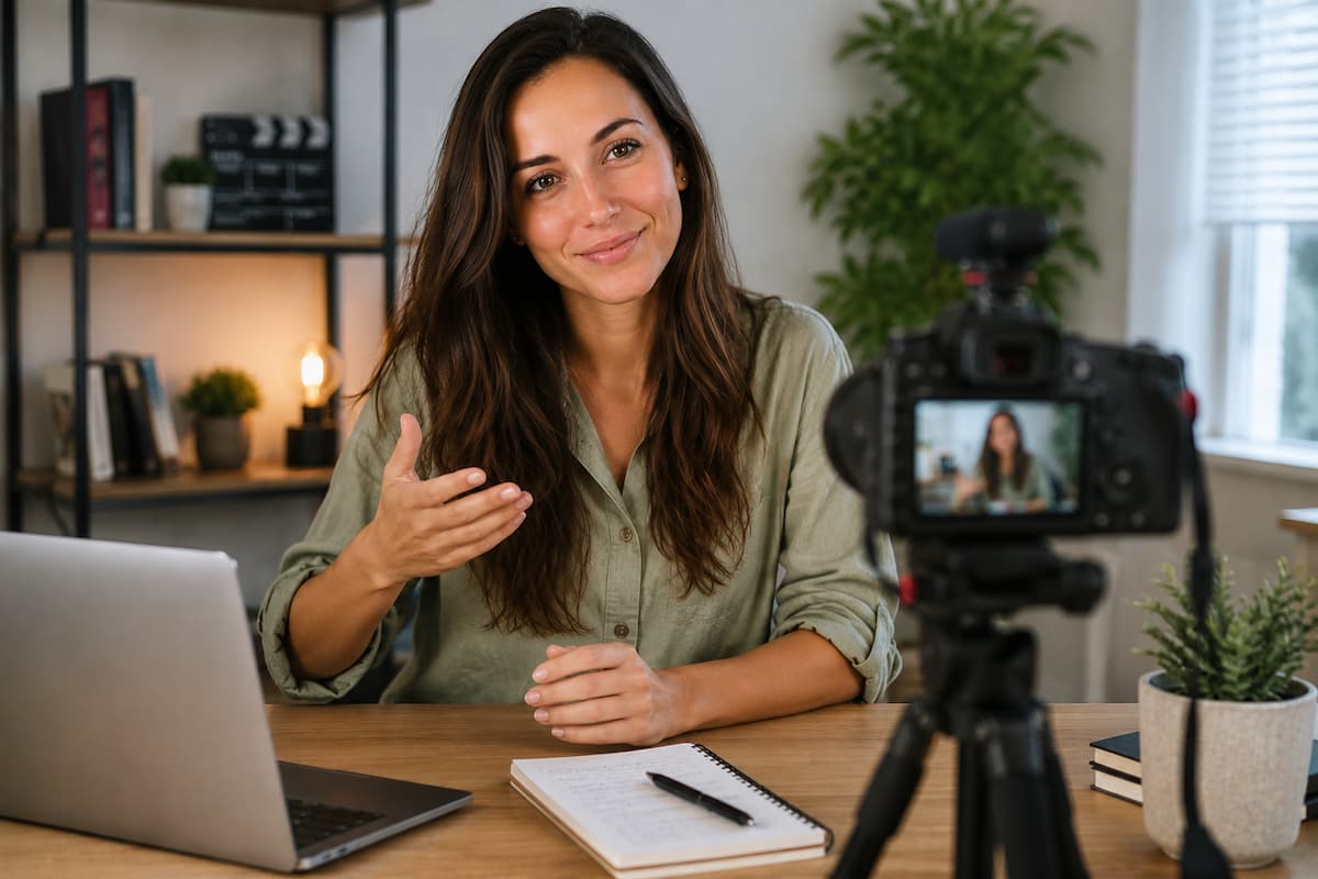
There is a specific kind of panic that sets in when the record button turns red. The script evaporates from memory. The hands develop a tremor. The voice shifts up an octave. This is not a defect of character. It is a physiological response to being observed. The camera is an eye that does not blink. It triggers the same ancient instinct that made our ancestors freeze when a predator appeared on the savanna. The difference is that the predator is an audience that may or may not exist yet, and freezing is exactly the wrong response.
The techniques that follow are designed to bypass this panic response. They are not about expensive equipment or advanced cinematography. They are about simple, mechanical adjustments that make video production feel manageable rather than overwhelming. Each technique addresses a specific beginner failure mode. Each requires minimal practice to implement. None require talent, which is fortunate, because talent is not a prerequisite for competence.
Rule of Thirds: The Grid That Makes Everything Look Intentional
Enable the grid overlay on your camera or phone. Two horizontal lines and two vertical lines create nine equal rectangles. Place your subject at the intersection of any two lines. Not in the center. The center is where beginners put things because it feels safe. It is also where things go to look boring.
The rule of thirds works because it creates asymmetry. The eye travels across the frame, landing on the subject, then resting in the negative space. A centered subject leaves the eye nowhere to go. It stares at the center and stops. An off-center subject invites exploration. The frame feels dynamic even when the subject is still.
This applies to everything: talking heads, product shots, landscape inserts, and title cards. The subject goes on a third line. The horizon goes on a third line. Eyes go on the top third line. The exception is symmetry, which is a deliberate choice, not a default. When you want to convey stability, formality, or unease, center. Otherwise, default to thirds.
📐 The Thirds Exercise
Take ten photographs of the same object. Five with the object centered. Five with the object on a third line. Show them to someone who does not know the exercise. Ask which five feel more “professional.” The centered images will feel static, documentary, and possibly accidental. The off-center images will feel composed, deliberate, and possibly artistic. The object is identical. The lighting is identical. The only variable is position. This is the power of the rule of thirds. It costs nothing to implement and transforms perception instantly. Enable the grid. Use it until it becomes unconscious. Then disable it and continue using it, because by then your eye will see the grid without the overlay.
Headroom: The Space Above the Head That Determines Everything
Headroom is the distance between the top of the subject’s head and the top of the frame. Too much, and the subject looks small, insignificant, and drowning in empty space. Too little, and the subject looks cramped, decapitated, or like they’re falling out of the frame. The correct headroom is approximately 10% of the frame height. For a talking head, this means the eyes sit on the top third line, and the forehead has modest clearance above it.
Beginners err on the side of too much headroom. They frame conservatively, leaving excessive space above the head “just in case.” This is the visual equivalent of speaking too quietly. It signals uncertainty. It makes the viewer lean in, not because they’re engaged, but because they’re trying to compensate for the compositional weakness.
The fix is mechanical. Frame the shot so the top of the head is approximately one forehead-height below the frame edge. Then check: can you see the subject’s hands if they gesture? If not, zoom out slightly or move the camera back. Can you see the subject’s waist? If so, you’re too wide. The sweet spot for a medium shot is from the top of the head to the mid-torso. The sweet spot for a close-up is from the top of the head to the mid-chest. Memorize these proportions. They apply across all cameras, all lenses, all content types.
180-Degree Rule: The Line That Prevents Confusion
When filming a conversation between two people, or any scene with multiple subjects, an invisible line connects them. The camera must stay on one side of this line for the entire scene. Crossing the line flips the spatial relationship. Subject A, who was on the left, suddenly appears on the right. The viewer’s mental map of the scene breaks. They feel disoriented without knowing why.
This is the 180-degree rule. It preserves screen direction. It maintains the viewer’s understanding of who is where. It is not a creative constraint. It is a spatial contract with the audience. Break it only when you intend to disorient, such as in dream sequences, fight scenes, or psychological horror.
The practical implementation: before filming, stand where the camera will be. Draw an imaginary line through the subjects. Choose your side. Mark it physically if necessary—a piece of tape on the floor, a note on your phone, etc. All camera positions for that scene must stay on that side. If you need to cross the line for a specific shot, do it with a neutral shot—a close-up of an object, a wide establishing shot, or a cut to a different scene—that resets the spatial orientation before showing the new angle.
⚠️ The Line-Crossing Mistake Everyone Makes
The most common 180-degree violation happens not during filming but during editing. The editor has two shots: one from the left of the line, one from the right. Both look good individually. The editor cuts between them, creating a spatial jump that confuses the viewer. The fix is not to avoid crossing the line during filming. The fix is to know the line exists and to cross it intentionally with a bridging shot. A reaction close-up. An insert of a hand gesture. A cutaway to the environment. These shots act as spatial reset buttons. They allow the camera to move to the other side without the viewer noticing the jump. The 180-degree rule is not about restriction. It is about control. Control the line, and you control the viewer’s understanding of space.
Three-Point Lighting: The Minimum Viable Professional Look
One light creates harsh shadows and flat dimensionality. Two lights reduce shadows but can still look flat if positioned symmetrically. Three lights, properly placed, create the illusion of depth that separates amateur video from professional video.
The three lights are:
- Key light: The primary illumination source. Positioned at approximately 45 degrees to the subject and 15-30 degrees above eye level. This creates the main exposure and the primary shadow pattern. The key light should be the brightest of the three.
- Fill light: Positioned opposite the key, at approximately the same height but at lower intensity—typically 25-50% of the key’s brightness. The fill reduces the contrast of the key’s shadows without eliminating them. Eliminated shadows look flat. Reduced shadows look dimensional.
- Back light (or rim light): Positioned behind the subject, aimed at the back of the head and shoulders. This creates a subtle edge of light that separates the subject from the background. Without it, the subject merges into the background, especially if both are similar in tone.
Beginners can approximate this with household items. A window becomes the key. A white poster board reflecting the window becomes the fill. A desk lamp aimed at the back of the head becomes the rim. The quality of the light matters less than the position. A cheap light in the right position outperforms an expensive light in the wrong position.
| Light | Position | Common Beginner Error |
| Key | 45° subject side, 15-30° above eye level | Too low (creates horror under-lighting) or too frontal (eliminates dimensionality) |
| Fill | Opposite key, same height, 25-50% intensity | Too bright (eliminates shadows, creates flatness) or too dark (harsh contrast remains) |
| Back/Rim | Behind subject, aimed at head and shoulders | Too bright (creates halo effect) or absent (subject merges with background) |
Shot Variety: The Rhythm of Visual Information
A video composed entirely of medium shots is a video that puts the viewer to sleep. The eye craves variation. Wide shots establish context. Medium shots carry conversation. Close-ups deliver emotion. Extreme close-ups create intensity. The alternation between these scales is the rhythm of visual storytelling.
The standard coverage for any scene includes:
Establishing shot: Wide, showing the environment. Sets the stage. Tells the viewer where they are. Used once, at the beginning of the scene or after a major location change.
Master shot: Wide enough to show all subjects in the scene. Captures the full action. Often used as a safety net during editing, providing coverage if specific angles fail.
Medium shots: Waist-up framing of individual subjects. The workhorse of dialogue and presentation. Used for 60-70% of most content.
Close-ups: Head and shoulders, or tighter. Delivers emotional weight. Reactions. Emphasis. Used sparingly for maximum impact.
Inserts and cutaways: Hands, objects, details of the environment. Breaks the visual monotony of talking heads. Provides editing flexibility.
The beginner error is filming only what is immediately necessary. A talking head video gets one angle, one framing, and one take. The editor has no options. The viewer has no visual relief. The solution is to capture at least three framings of any important moment: wide, medium, and close. Even if you only use the medium shot, the alternatives provide insurance and editing rhythm.
✅ The Coverage Checklist
Before concluding any recording session, verify you have one establishing shot of the location, one medium shot per subject, one close-up per subject, at least two insert shots of relevant objects or actions, and one safety take of any critical dialogue. This takes five extra minutes during filming and saves hours during editing. The alternative is discovering in post-production that you have no cutaway to cover a jump cut, no close-up to emphasize a key point, and no alternative angle to fix a framing error. Coverage is insurance. Cheap insurance. Take it every time.
Audio as Foundation: The Technique That Outperforms Video
Viewers forgive poor video quality. They will not forgive poor audio quality. A grainy, shaky video with clear audio maintains an audience. A pristine 4K video with distorted audio loses the audience immediately. Audio is the trust signal. It determines whether the viewer perceives the content as professional or amateur before a single visual judgment is made.
The beginner audio technique is proximity. Get the microphone close to the sound source. For voice, this means 6-12 inches from the mouth. For every doubling of distance, sound volume drops by half (the inverse square law). A microphone at 24 inches captures one-quarter the sound energy of a microphone at 12 inches. To compensate, the recording device amplifies the signal, which amplifies room noise, echo, and electrical interference along with the voice.
Proximity solves more audio problems than any equipment upgrade. A $50 microphone at 6 inches outperforms a $500 microphone at 24 inches. The expensive microphone is more sensitive, which means it captures more detail at close range, but it also captures more noise at long range. The cheap microphone, positioned correctly, captures a clean signal that requires minimal processing.
Secondary audio technique: record in a small, soft space. Closets with clothes. Corners with bookshelves. Spaces with carpet and curtains. Hard surfaces reflect sound. Soft surfaces absorb it. Reflections create echo, which smears clarity. Absorption creates dryness, which isolates the voice. The ideal recording space is not a professional studio. It is any space where the voice sounds dry and present when you clap your hands.
B-Roll: The Visual Evidence That Supports the Narrative
B-roll is not decoration. It is evidentiary footage. When the narrator says “I set up the microphone,” the B-roll shows the microphone being set up. This visual confirmation creates trust. It proves the narrator is describing real actions rather than fabricating them. Even in fictional content, B-roll grounds the narrative in physical reality.
The beginner mistake is treating B-roll as optional. It is not. It is essential for three editorial functions: covering jump cuts in the primary footage, illustrating abstract concepts with concrete visuals, and providing pacing variation that prevents visual fatigue.
Capture B-roll with intention. Before filming, list the concepts that need illustration. For each concept, plan at least two shots: a wide shot showing the full action and a close-up showing the detail. Film these shots from multiple angles. A microphone setup gets a wide shot of the desk, a medium shot of the hands adjusting the stand, a close-up of the cable being plugged in, and an insert of the level meter responding. Four shots for one action. The editor uses one or two. The alternatives provide flexibility.
🎬 The B-Roll Ratio
Professional editors work with a B-roll ratio of approximately 3:1 to 5:1. For every minute of primary footage (talking head, interview, main action), they have three to five minutes of B-roll. This abundance allows them to choose the best shots, cover the most edit points, and maintain visual variety. Beginners often have a ratio of 1:1 or less. They film exactly what they need and no more. The result is editorial constraint. The editor cannot cover a jump cut because there is no alternative footage. The viewer sees the same shot for three minutes because there is nothing else to show. Film B-roll generously. It is the raw material of visual storytelling. Scarcity at the capture stage creates poverty at the edit stage.
These techniques are not advanced. They are foundational. The rule of thirds, proper headroom, the 180-degree line, three-point lighting, shot variety, proximity audio, and intentional B-roll are the baseline of competent video production. Master them and your content will look professional regardless of equipment cost. Ignore them and your expensive camera will produce expensive-looking amateur work. The technique is the multiplier. The equipment is merely the starting value. A high multiplier on a low starting value outperforms a low multiplier on a high starting value every time.
Practice one technique per project until each becomes automatic. Do not attempt to implement all seven in your first video. Build the habit of thirds in video one. Add headroom discipline in video two. Introduce lighting awareness in video three. By video seven, the foundation is solid. Everything after that is refinement. Refinement is enjoyable. Foundation-building is tedious. Do the tedious work first. The enjoyment follows.

Riley Bennett writes about content creation, streaming gear, and building efficient creator workflows at estergamer.com. After spending years testing equipment and figuring out what actually works versus what just looks impressive, Riley focuses on practical, no-nonsense advice for beginners starting from scratch. When not writing, Riley enjoys exploring new tech, refining home studio setups, and helping fellow creators skip the expensive mistakes that slow most people down. The goal is simple: honest guidance that gets real results without the marketing fluff.