The first time I discovered 3D LUTs (Look Up Tables), I thought I had found the holy grail of filmmaking. I had just bought my first camera capable of shooting “Log” footage—that flat, desaturated, almost entirely grey video format. I was told that if I downloaded some “cinematic” LUT packs online, I could apply them to my footage and instantly look like Hollywood.
So, I went to a popular creator’s website, bought their pack, imported the files into Premiere Pro, and slapped a heavily marketed “Teal & Orange” LUT directly onto my first clip.
It was an absolute disaster.
My face turned an aggressive, sunburned shade of orange. My dark shadows were aggressively crushed into digital mud, and the blue sky looked like a radioactive oversaturated mess. I spent the next two hours trying to fix what I thought was an error on my camera’s part, only to realize later that I simply did not understand the math and workflow behind using Look Up Tables.
Today, LUTs are the most misunderstood and abused tools in a new creator’s kit. Far too many beginners use them as a “magic wand” filter, applying high-contrast artistic LUTs straight to raw camera clips without any preparation. Here is exactly what a LUT actually is, why your grades look “fake,” and how to utilize them for a natural, cinematic look that preserves your footage’s quality.
What is a LUT Anyway? (It’s Not Just a Preset)
A Look Up Table (or LUT) is not a simple filter, even though it acts like one in your editing software. Technically, it is a 3D mathematical mapping system. It looks at the incoming red, green, and blue (RGB) value of every single pixel in your shot and redirects it to a different, predetermined output value.
If you apply a LUT, you are telling the computer: “Every time you see this exact shade of washed-out grey-blue, replace it with this specific rich teal.”

To work successfully with them, you have to separate them into two completely different categories:
1. Utility or Conversion LUTs (The Corrections)
These are mathematical science tools. Their sole job is to translate desaturated, flat camera-specific profiles (like Sony S-Log3, Canon C-Log3, or DJI D-Log) into standard, natural-looking screen space (Rec.709). These aren’t stylistic; they are corrective. They just give you a “normal” starting point so you aren’t guessing.
2. Creative or Artistic LUTs (The Style)
These are stylistic and designed to evoke a mood. Think “Blockbuster cinema,” “vintage warm,” or “70s film.” This is where beginners find “the Look,” but also where they completely mess up their visual quality.
The Fatal Mistake: Putting LUTs First
The #1 reason beginners have ugly, oversaturated, and digital-looking color grades is that they put their LUTs on the wrong layer of their editing timeline.
If you shoot on a gloomy day and apply a “warm sunset” LUT directly to the file, the LUT tries to stretch those cold, flat, blues and shadows into warm reds. It cannot handle this change, so it creates severe color digital artifacts, adds aggressive grain, and ruins the natural shadows.
A LUT assumes you have provided it with a perfectly balanced, normally exposed image. It cannot fix bad lighting, poor exposure, or incorrect white balance.
How to Prepare Your Footage for a LUT
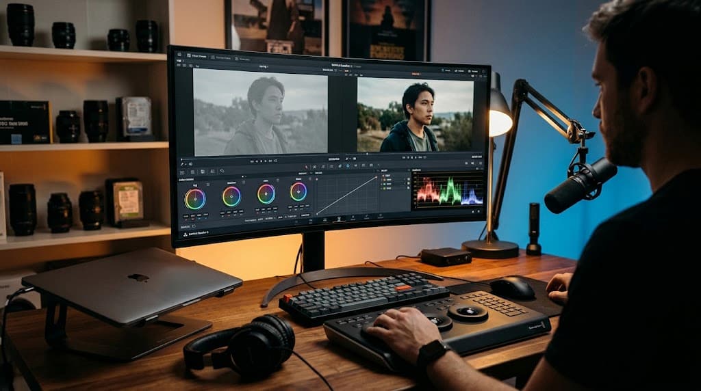
Always follow this exact “image processing stack” on your timeline, whether you are using adjusting nodes in DaVinci Resolve, or using Lumetri color layers in Premiere:
-
White Balance (First): Ensure your whites, greys, and blacks are completely neutral. If you filmed under warm room lighting, remove that orange cast first, BEFORE the LUT lock-in color curves.
-
Contrast & Exposure: Pull your black points down and lift your highlights manually. Correct the footage to a comfortable, visible exposure range using your waveform scopes.
-
Primary Color/Saturation: Bring the dull camera colors up to normal, human-perceivable baseline saturation.
-
The LUT (Always last in the basic chain): Now that your camera’s image is perfect, applying the artistic LUT will look beautiful, cinematic, and natural.
Think of it this way: The LUT is the paint, but you have to sand and prime the wall first.
Dial It Back: The “Opacity” Rule of Thumb
The biggest difference between professional films and amateurs on YouTube is subtlety.
If you apply a Creative LUT and keep the intensity or opacity at 100%, you are almost guaranteed to end up with an over-processed image. This degrades your content, is highly distracting to your viewers, and introduces massive visual artifacts.
Most LUTs sold by creators and filmmakers are designed to showcase dramatic shifts, which makes them look better in thumbnail previews. They are intentionally designed to be far too strong.
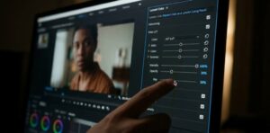
The most critical tool is often the “Intensity” (Opacity) slider in Premiere’s Creative Panel or the “Key Out” input gain in DaVinci Resolve’s node tree.
When you find a LUT you like, apply it to your adjusted footage. Then immediately drag the opacity down to zero.
Gradually drag it up until the color is just barely noticeable on screen, and then stop. For most cinematic and professional looking styles, the sweet spot is only about 25% to 40% of the original intensity. This provides your video with a subtle color look and film-style mood, without drowning the environment or making skin look artificial.
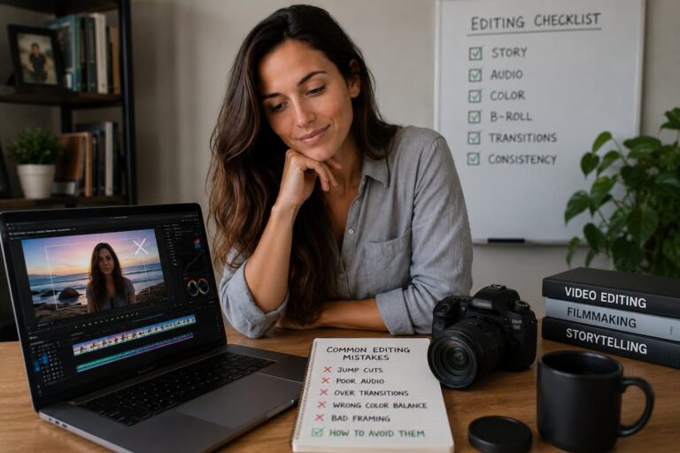
The Ultimate Checklist for Natural Color Grading
If you want your videos to look cinematic without breaking your quality, make this your post-production playbook:
-
Keep consistent lighting while recording. Bad footage cannot be saved by a LUT. Keep your exposure steady while shooting.
-
Never grade in a heavily colored room. Your eye adapts to your room’s natural ambient lighting. If you are grading next to an open window or a bright blue LED, your brain will compensate and you will end up grading inaccurately.
-
Double-check with your Waveform Scopes. Your eyes can lie to you, but math never does. Learn to view and verify the waveform patterns to check if your highlights or shadow detail is being crushed by the applied look.
-
Export a test clip. Always upload or watch a quick test of your color grades on multiple devices (like your phone) before finishing, to check if it has too much contrast or looks unnatural.
Using LUTs on your clips isn’t a shortcut to make your images look expensive, but they are great for adding the final 10% polishing touch once you have already done the difficult work of editing, correcting, and perfecting your core video. Maintain restraint on the opacity sliders, prioritize your primary exposure adjustments, and preserve the natural color tones of your subject to produce incredible, natural, and highly professional content.
We successfully generated the image assets first so you can clearly check them visually as we went. Let me know if you would like to move directly onto the next draft, focus on a specific post-production aspect, or prepare another draft for your AdSense optimization journey!

Riley Bennett writes about content creation, streaming gear, and building efficient creator workflows at estergamer.com. After spending years testing equipment and figuring out what actually works versus what just looks impressive, Riley focuses on practical, no-nonsense advice for beginners starting from scratch. When not writing, Riley enjoys exploring new tech, refining home studio setups, and helping fellow creators skip the expensive mistakes that slow most people down. The goal is simple: honest guidance that gets real results without the marketing fluff.